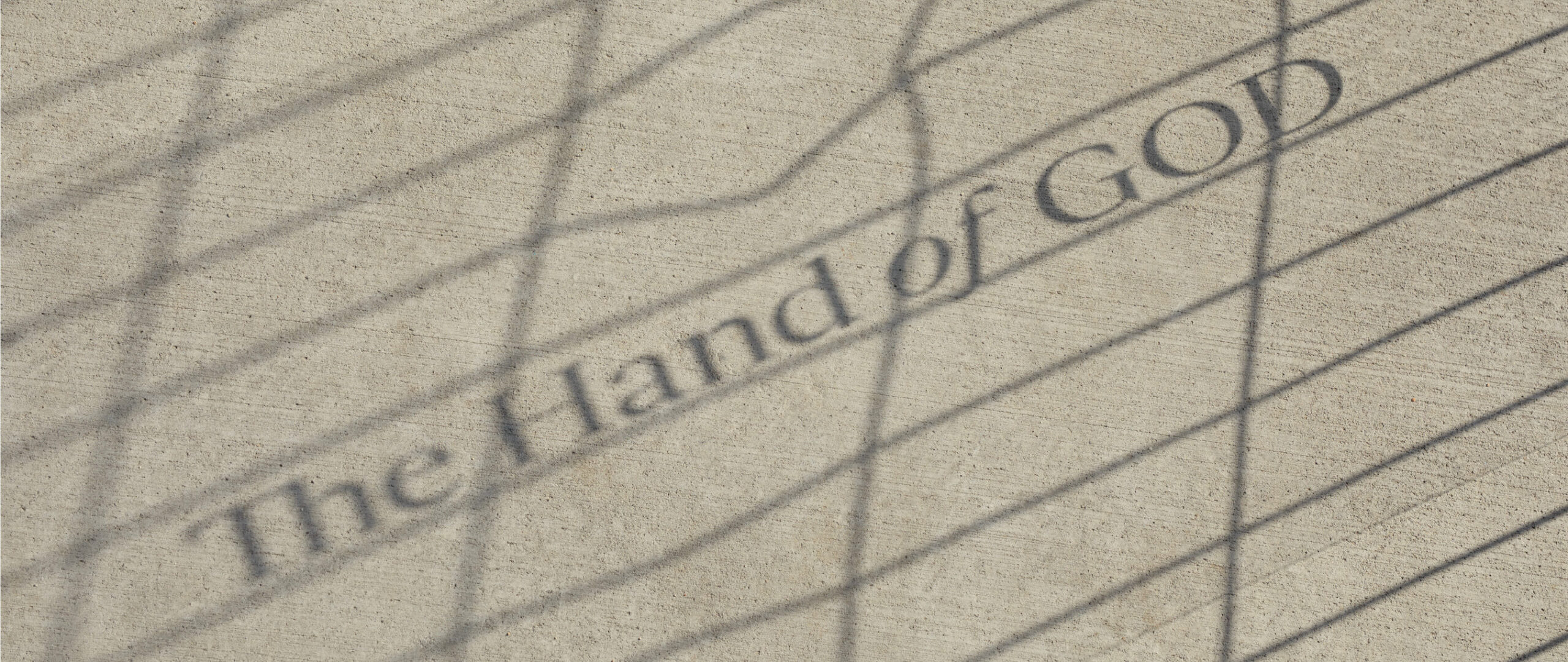
Gestura was designed to offer both the effortless reading experience of a workhorse serif and the striking personality of a display face.

With an underlying calligraphic quality, Gestura is formally restless but always controlled. Its contradictory characteristics are finely balanced, adding up to a naturally consistent whole.

At 42 styles and 3 optical sizes, with an abundance of alternate stylistic features, Gestura is a genuine do-it-all serif, just as effective for long-form copy, striking headlines or expressive display type.
    A new take on Old style

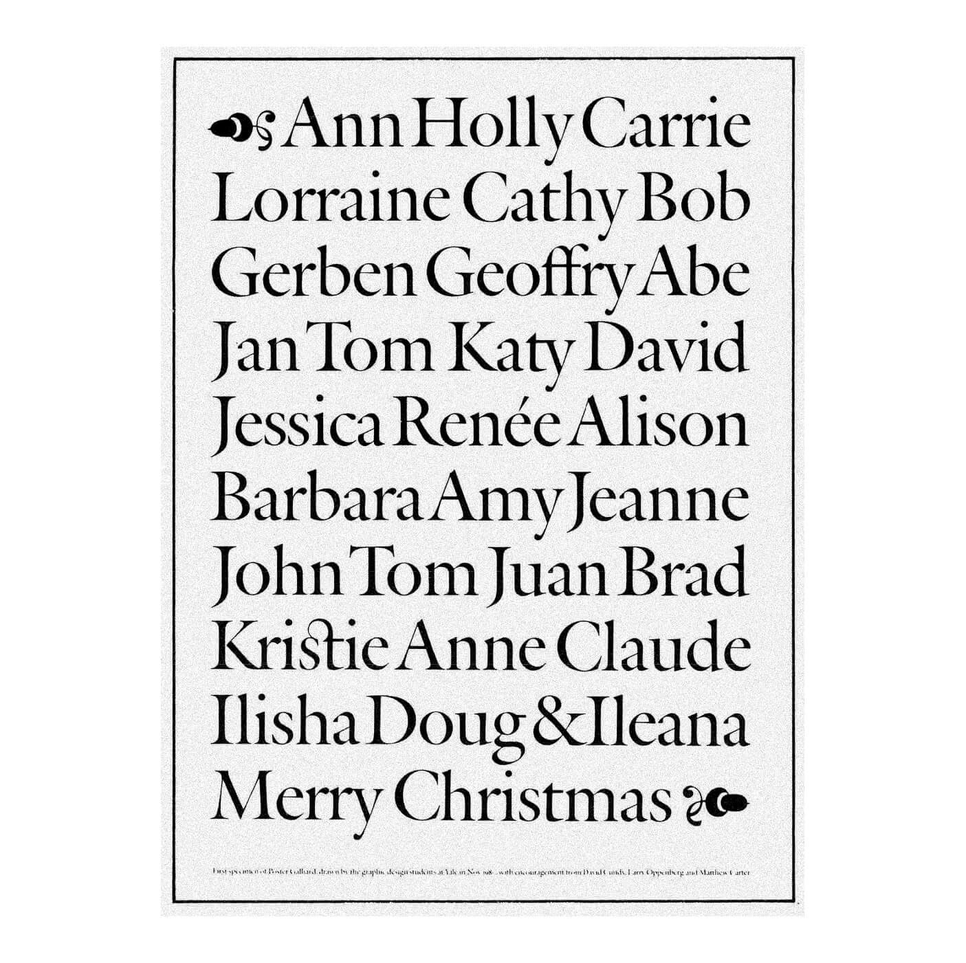
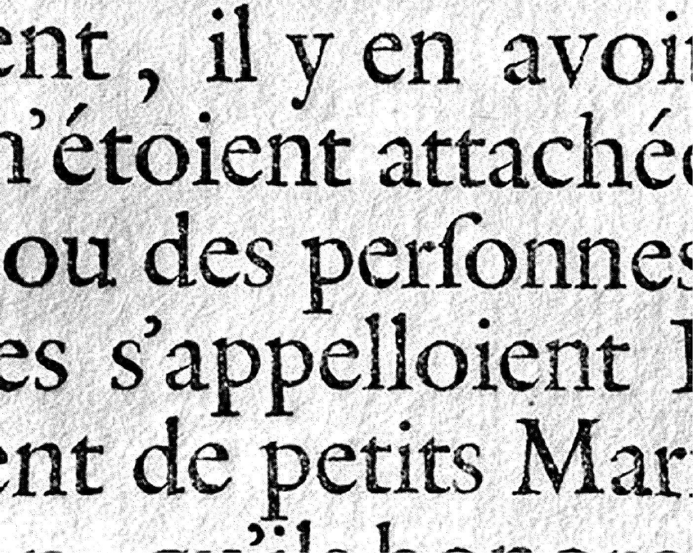
    Gestura’s roots lie in the 16th century old style tradition, exemplified by Robert Granjon’s Gros Cicero, and in later revivals such as Matthew Carter’s Galliard, and Monotype’s Plantin. With careful attention paid to the balance of legibility and distinctive personality, Gestura’s counter proportions more closely resemble Granjon’s original model, while moments of minimalist detail are influenced by Plantin’s more reductive form.

    Gros Cicero, Printed in Paris - 1742
      A B
      Plantin 110: 1960-1979
      • A
      • B
      ITC Galliard, Mathew Carter, 1978

        Harmony & conflict

        Gestura’s unique character comes not just from its calligraphic roots, but the conflicting impulses of its design. Details that shouldn’t make sense together, somehow do.

        Graceful curves abruptly meet hard-edged, wedge-like terminals. Ornate calligraphic strokes adjoin minimalist reductions of traditional serif forms. Moments of humanistic influence peek from an unimpeachably modern framework.

        Within the broad extent of styles and optical sizes, personality ebbs and flows. From curvaceous warmth, to icy precision. From delicately poised, to unapologetically robust.

        A B
        Gestura’s Uprights
        • A
        • B
        Shifts in Gestura’s direction of nib causes flaring
          Gestura Headline: Extralight Italic

            A Free Hand

            The contrast between Gestura’s characteristic flowing curves and unconventional wedge-like terminals is most pronounced in its italic styles, where the influence of broad-nibbed pen calligraphy is all the more evident.

            Gestura Headline: Regular + Italic

              Style it out

              Gestura’s six stylistic sets offer the opportunity to customise the typographic voice to suit different moods and uses. Sets 1–3, for all roman and italic styles offer customisation of punctuation, numerals and uppercase, while sets 4–6 are for italics only, offering the option to highlight Gestura’s calligraphic qualities.

              A B
              ss.01 - Monolinear alternates
              • ON
              • OFF
              A B
              ss.02 - Alternate old-style zero
              • ON
              • OFF
              A B
              ss.03 - Titling dieresis
              • ON
              • OFF
              A B
              ss.04 - Alternate italic g,k,y
              • ON
              • OFF
              A B
              ss.05+06 - Alternate italic v,w+&
              • ON
              • OFF

              For gestures big and small

              Gestura’s three optical sizes offer great versatility. While the Text family is ideally suited to long-form reading, certain key characteristics are refined and exaggerated in the Headline and Display families, projecting Gestura’s unique voice further when used at larger sizes.

              A
              Agincourt
              Aged
              • Gestura Text
              • Gestura Headline
              • Gestura Display
              Gestura Text: Light

                All the glyphs

                With 617 glyphs per style, Gestura offers an extensive range of features including old style figures, subscripts and superscripts, broad linguistic coverage, alternates and ligatures.

                A
                Â

                Beyond Text

                Although Gestura’s Text family is designed with long-form copy in mind, its usage is by no means limited to small scale type. With its characteristically bulky detailing and distinctive chamfered corners, the Text family offers a unique and robust alternative to the Headline and Display families when used at larger sizes.

                Gestura Text: Thin, Thin Italic & Light

                  Specimen download

                  Download a PDF specimen to view all the important information in one place – samples of every style in the family, character sets, OpenType features, language coverage and details of every available license.

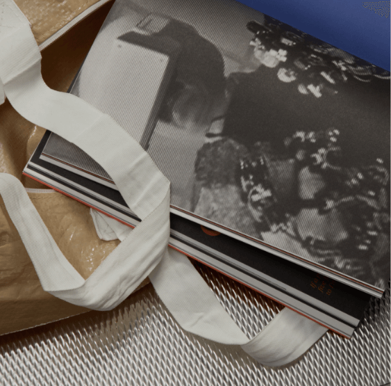
                    Sociotype Journal Issue #1:
                    “The Gesture”

                    EDITION OF 1,500 COPIES
                    224 PAGES · 210 × 275 MM
                    ISSN 2754-7698

                    SECTION SEWN, PRINTED IN 4 COLOURS
                    + 2 SPECIAL PANTONES
                    8 PAGE FOIL EMBOSSED COVER

                    EDITION OF 1,500 COPIES
                    224 PAGES · 210 × 275 MM
                    ISSN 2754-7698

                    SECTION SEWN, PRINTED IN 4 COLOURS
                    + 2 SPECIAL PANTONES
                    8 PAGE FOIL EMBOSSED COVER